
Company story5 min read
Why does IKEA walk you through every room?

One path past everything: how a store layout guides your steps, and where guiding a user turns into trapping them.
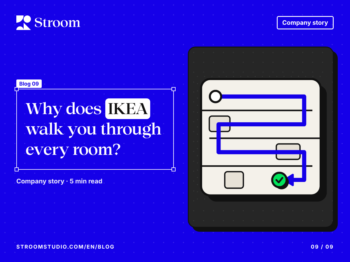
You go into IKEA to buy one shelf. Two hours later you leave with two candles, a plant and a storage box you didn’t know you needed. That didn’t happen by chance.
One path past everything
Most IKEA stores are built around a single, one-way route. You start in the showrooms upstairs, where furniture is set out in complete rooms. Then you go down through the market hall of smaller homewares and the warehouse, where you pick up the flat-pack boxes yourself. Last come the checkouts.
Arrows on the floor lead the way, and the exit only appears at the end.
Why the layout works
- You see everything. You can’t reach what you came for without passing every other department.
- You picture a home, not an item. A sofa isn’t shown alone but in a full room with a rug, a lamp and cushions, so you picture the whole scene and want the whole scene.
- You forget your list. Researchers who study store layouts, such as Alan Penn at University College London, have described the route as maze-like: visitors lose track of what they came for and buy things they hadn’t planned. Retail calls this the “Gruen transfer”, after the architect Victor Gruen.
Even so, many IKEA stores also mark shortcuts between departments, for people who know what they want.
The same thing on a screen
Digital products draw paths too: sign-up steps, checkout, an app’s first-run setup. A clear path helps people focus and reduces mistakes.
But the line between guiding users and trapping them is thin. When signing up is easy and cancelling is hard, or the back button disappears, the path becomes what the designer Harry Brignull originally called a “roach motel”: easy to get into, hard to get out of.
The takeaway
Design one clear path for people who need guidance, then always show the shortcut for people who know what they want.
Sources
- Gruen transfer, Wikipedia
- Hard to cancel (formerly “roach motel”), Deceptive Patterns, Harry Brignull