
Guide4 min read
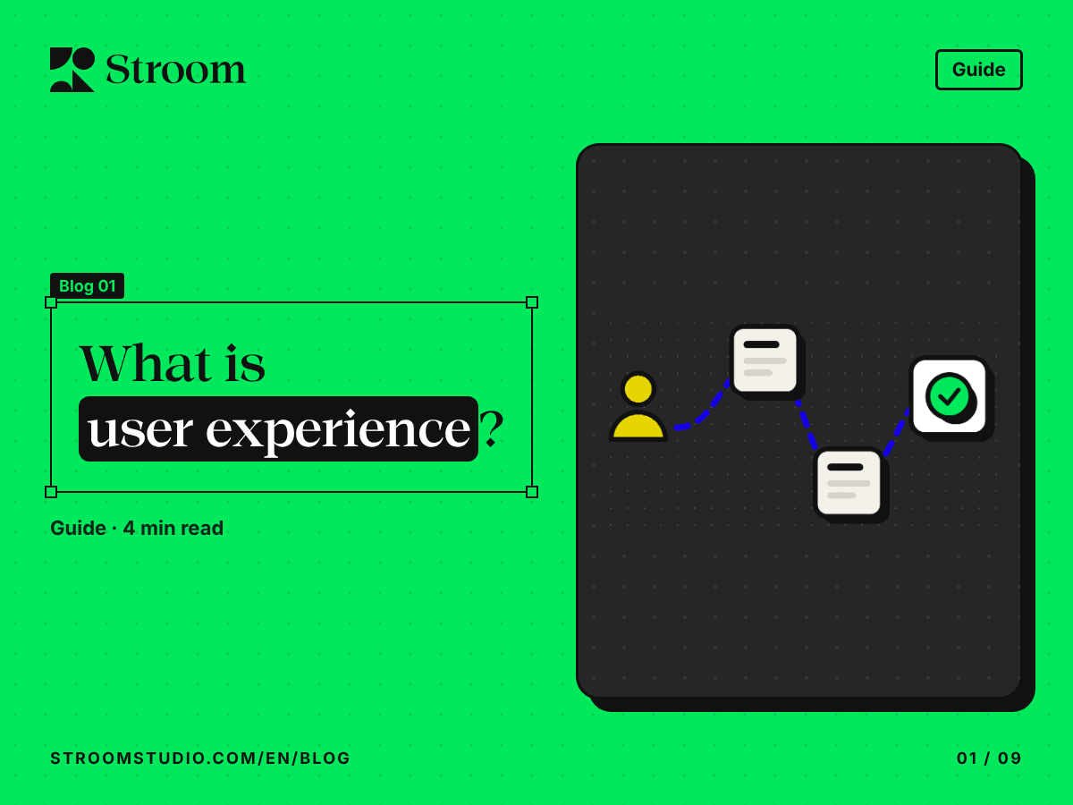
What is user experience?

User experience in plain words: how it differs from UI, what the work involves, from research to testing, and an everyday example.
Blog
We explain why things are designed the way they are: short articles in plain language, with one example and one idea to take away.
Guide4 min read
User experience in plain words: how it differs from UI, what the work involves, from research to testing, and an everyday example.
Why like this?5 min read
What McKinsey, Baymard and Forrester actually measured about UX and conversion, revenue, support costs, rework and retention.
Design tip5 min read
Users and context first, then platform conventions, right-to-left and accessibility, with cheap tests before you build.
Guide5 min read
What a design system is made of, when your product needs one and how to build it step by step, with what one study measured.
Guide5 min read
Where UX should sit, who to hire first, the rituals that connect it to product and engineering, and how to measure progress.
Why like this?5 min read
Why a product’s experience needs ongoing maintenance after launch, and a simple rhythm to keep up as users, platforms and standards change.
Why like this?4 min read
It isn’t you, it’s the door. On handles that say one thing while the door does another, and what that means for every button on a screen.
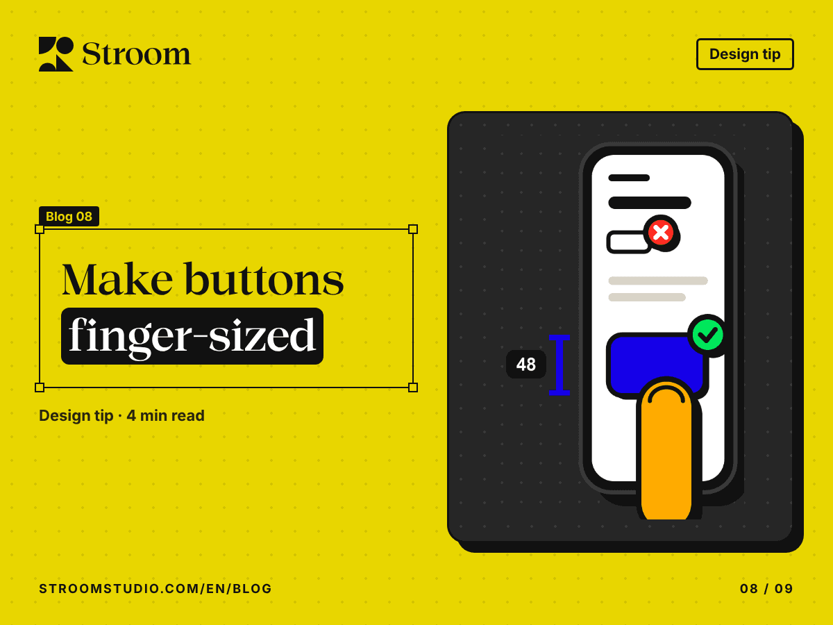
Design tip4 min read
Why design guidelines ask for touch targets of at least 48 px, and how to get there without making every icon bigger.
Company story5 min read
One path past everything: how a store layout guides your steps, and where guiding a user turns into trapping them.
Why everyday things and screens work the way they do, in three series: “Why like this?”, “Design tip” and “Company story”.
Yes. Every article is published in Arabic and English, and you can switch between them from the language button at the top of the page.
Subscribe to the RSS feed, or follow Stroom on Instagram, where the same three series appear.
Tell us about your product and what you are trying to achieve, and we will get in touch to plan the next step.
Start your project